
Article directory
I've been researching short videos these past couple of days and discovered something quite interesting.
Have you noticed that when you're scrolling through Douyin (TikTok) , it's full-screen portrait mode, but when you're scrolling through Xiaohongshu (Little Red Book) , it's a different aspect ratio, and when you open Bilibili (Bilibili.com), it's landscape mode? I never paid attention to it before, thinking that phone screens are only so big, so what difference does the aspect ratio make?
But upon closer examination, it became clear that the matter was not so simple.
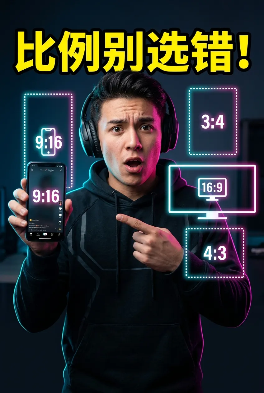
9:16 Vertical Full Screen: The First Choice for Short Video Streaming
Let me tell you, video aspect ratio might seem insignificant, but it determines how much space your content occupies on a user's phone. The larger the space it occupies, the higher the cost for the user to swipe away. It's that simple.
Let's start with 9:16, which is the vertical full-screen format used in Douyin, Kuaishou, and WeChat Video Channels. Why is this ratio so great? Because it perfectly matches the way you hold a phone. You hold your phone vertically, so it fills your entire screen.
When users scroll through your video, your content fills the entire screen, maximizing immersion. Imagine a person in a short video, taking up the entire screen from head to toe—the impact is something landscape mode can't provide. Therefore, 9:16 is the preferred format for short video streaming, without a doubt.
However, a problem arises: the 9:16 aspect ratio has a minor drawback. It's too "full," and if you want to add subtitles or titles, they can easily be blocked by the status bar at the top or the navigation bar at the bottom of the screen. This is especially true for knowledge-based content that requires subtitles; you have to be extra careful with the layout when using a 9:16 aspect ratio.
3:4 vertical large image: Xiaohongshu's must-have for product recommendations
This leads to the 3:4 ratio.
3:4在小红书上特别常见,尤其是信息流里的视频。它比9:16窄一点,但比16:9高。这个比例的好处是什么?它在小红书双列瀑布流里能占据最大的曝光面积,同时顶部或底部还能预留出空间放字幕或标题。
If your main focus is on product recommendations on Xiaohongshu (Little Red Book) or posting videos on WeChat Moments, a 3:4 aspect ratio is a smart choice. It ensures visual impact while preventing content from being obscured by UI elements.
16:9 standard landscape mode: the standard for long video content
Furthermore, 16:9 is the standard landscape aspect ratio. Long videos on Bilibili, YouTube , Xigua Video, TV channels, and movies are mostly in this ratio. It conforms to the natural viewing angle of the human eye and also to the aspect ratio of TV and computer screens.
For creating scenic landscapes, film and television commentary, courseware tutorials, and game gameplay videos, 16:9 is the most suitable aspect ratio. It offers a wide field of view and a large amount of information, making it ideal for content that needs to showcase more details.
However, 16:9 has a problem on mobile phones: it leaves a large black border, making it less visually impactful than portrait mode. Therefore, very few people use 16:9 for short videos now, unless the content requires landscape display.
4:3 Traditional Landscape: Exclusively for Retro and Nostalgic Style
最后说4:3,这个比例现在比较少见了。早期电视和电脑屏幕就是4:3,现在基本被16:9取代了。但4:3有个独特的感觉,就是复古怀旧。画面更聚集于中央主体,有种老电影的质感。
Currently, the 4:3 aspect ratio is used either for retro-style film and television productions, educational videos, or retro vlogs. Another use is for videos with side-panel text and images; the 4:3 aspect ratio combined with decorative elements on both sides creates a very stylish look.
The Platform Ecosystem Game Behind Video Ratios
Think about it, this issue of proportions is actually a game of strategy between the ecosystems and user habits of different platforms. Douyin wants full-screen immersion, Xiaohongshu wants information retention, and Bilibili wants a broad perspective. Each platform is using product design to guide creators to make specific choices.
This reminds me of an article I read before, which discussed the evolution of mobile phone screens from 4:3 to 16:9 and then to full-screen displays. Essentially, changes in screen ratios are a competition for users' attention. Whoever can occupy more visual space per unit of time wins.
So before you create content, first figure out where your main battleground is. Use 9:16 for viral content, 3:4 for product seeding on Xiaohongshu, and 16:9 for landscape long videos. Don't underestimate this choice; it directly affects the first impression your content makes on users.
I'm still figuring things out myself, and these are conclusions I've drawn from some materials and observations. Some of my ideas may not be fully developed yet, but at least they can help you avoid some pitfalls.
Since you've read this far, if you found it helpful, please like and share it. If you want to receive updates first, you can also follow me!
Thank you for reading my article. See you next time.
Hopefully, the article "How to Choose the Right Short Video Size? 9:16/3:4/16:9/4:3 Mainstream Platform Vertical/Horizontal Aspect Ratios and Export Guide" shared on Chen Weiliang's blog ( https://www.chenweiliang.com/ ) will be helpful to you.
Feel free to share this article's link: https://www.chenweiliang.com/cwl-34513.html